Introduction
2020 has brought us a lot of things, from Australian wildfires to Umbrella Academy to explosion in Beirut to US elections. However, almost the whole year, everybody was affected by one common thing, COVID-19. It was originated in Wuhan, China and it has spread like wildfire. The closest humanity came to a pandemic of this magnitude was the Spainish Flu in 1918 (which had nothing to do with Spain), which infected 500 million people in 4 waves, almost a third of the population at the time. COVID is not as deadly as the Spainish flu, nevertheless it has still claimed the lives of 1.6 million, and infected 75 million people. It is expected that the virus will last till 2022. In this article i will be talking about what how prevelant the virus is as of today, how it has grown in the past, inflections points, how many more people can be expected to be infected in the future during what time-frame, and how has the market and indutry been affected by it. The code for the article can be found here.
Current Scenario
As of right now, there are only a few countries that have not been affected by coronavirus. The first wave in Europe is over, and second wave is in action now. The following image shows as of today, top 10 infected nations in the world with respect to confirmed cases.
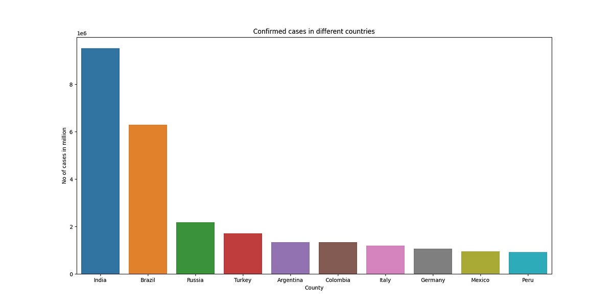
India tops the list with more than 9 million cases, followed by Brazil with 6 million, Russia with 2 million and Turkey with 2 million again. Pandemic in Russia is comparetively a recent event compared to China or mainland Europe. Interestingly, USA did not make the list (which is a good thing) and now with the availability of the vaccine, the numbers will drop down furthermore.
Next graph shows countries with highest number of deaths.
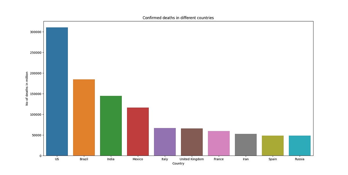
US has the highest number of deaths, 300k, followed by Brazil at 200k. Deaths in India are at 150k. India has the highest number of confirmed cases as well as third highest number of deaths.
Next we come to number of recovered cases.

India has the highest number of recovered cases, at 8 million, followed by Brazil at 6 million. Russia comes third at 2 million cases. If you look closely, the confirmed cases plot looks almost same as the recovered cases plot. Another thing to note here is that not a lot of European countries, or the USA made the list, just Italy and Germany. Most south american countries and India apparently recovered from COVID.
COVID growth: 2020
If we plot number of confirmed cases, number of deaths, or number of recovered cases aginst time, they follow the same plot, which is shown below
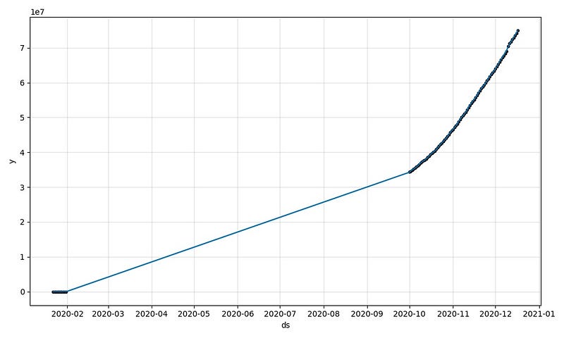
The plot is number of cases worldwide, plotted against time. We can see that it is a straight line, up until 2020–10, or october. Something happened in October that made the number of confirmed cases, deaths and recovered cases go on the rise. My guess is that this was the second wave, and it’s effects showed up in November because of which there was a second lockdown in Germany and France.
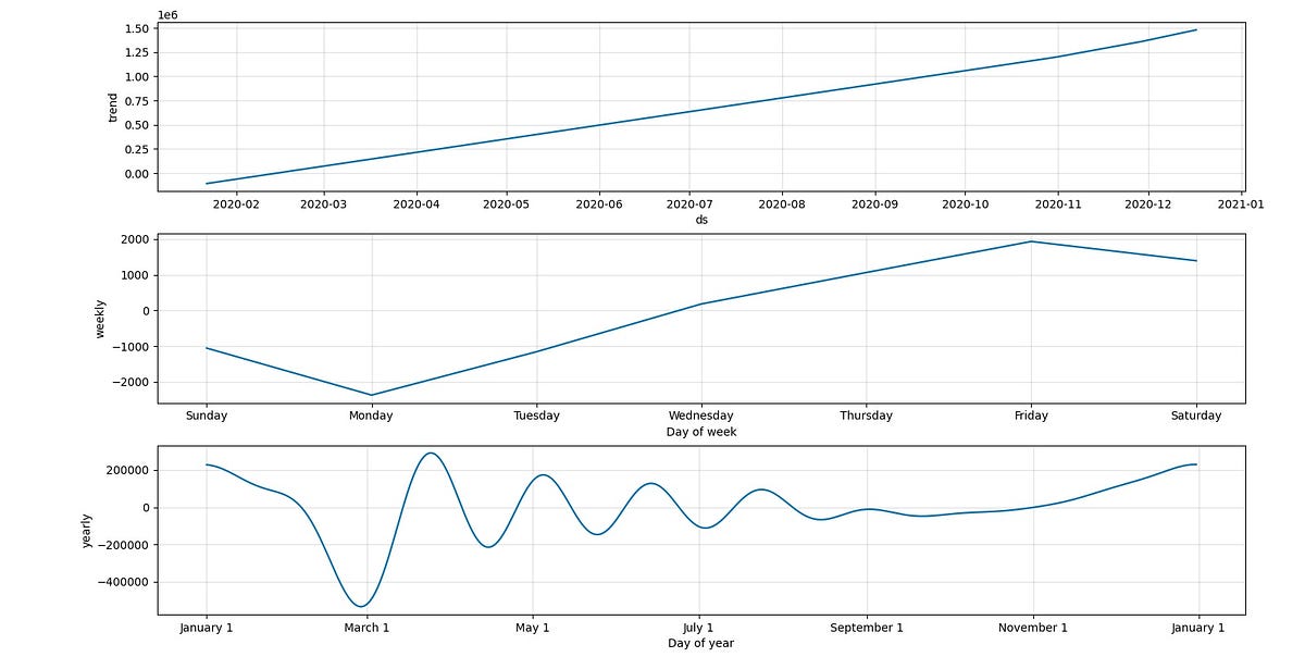
We can also decompose this graph in 3 other graphs, namely trend, weekly pattern and yearly pattern. We can do this for all three graphs, confirmed, deaths and recovered. Let’s start with confirmed.
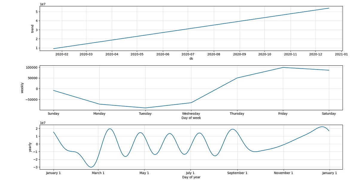
As you can see from the image, first plot is the trend of coronavirus, over the duration of 1 year. It is a straight line, which increases with time, which means the number of coronavirus cases go up.
Second plot is the weekly pattern of the coronavirus. Apparently, the virus boils down at the begining of each week, and starts up again as the weekend comes up.
The last plot is the most interesting. It shows that during march to september, covid followed a sine wave. Which means in some part of the world number of cases were going down, whereas in some other part of the world new cases we coming up. This happened until september, forth which there was a constant increase, and again this is my guess, this is the second wave again.
If we plot the same graph for deaths, we get the plots that look something like
Trend is the same, an ever increasing line. Weekly is again almost the same, slow on the start of the week and high at the end of it.
Yearly shows an interesting trend. Where it started as a sine wave, it slowly dissolved into a line which started increasing, which means the number of deaths oscillated from high to low between march to september, it stabalized after september, which my guess is, the second wave.
If we plot the same graph for recovered cases, it looks like this

Weekly and trend are the same, yearly plot oscillates from high to low from march to september, then it started increasing, which is a good thing as we want more people to recover. And, again my opinion, it stabalized and started increasing because it was the start of the second wave.
Modelling the pandemic: SIR epidemic model
SIR epidemic model is a simple mathematical description of spread of disease in the population. It divides a population of N individuals into three groups, which vary over a function of time, t:
a) S(t) -> Who can be infected
b) I(t) -> Who have been infected
c) R(t) -> those who have recovered from it
SIR model describes the change in population of each of these groups in terms of two parameters, beta and alpha. Beta describes the rate at which disease spreads, and alpha is the rate at which a person recovers. It is to be mentioned that SIR model does not take waves into account.
The model is as follows

When we plug in the total population N, initial number of infected people I and number of recovered people R, we get a plot of how far the pandemic will spread before stabalizing and finally vanishing
After pluggin in the values of the variables,
Total population = 7.5 billion
Confirmed cases = 75 million
Rate of infection = 4 (source![]() )
)
Recovery rate = 25 days (10 days for symptoms to occur, 15 days for recovery)
We get the following plot

We can see from the image that the green line (Recovered with Immunity) is achieved in 70 days for a major population. Also, the red line (infected) goes as high as 70 million again in the second wave, but they start dropping faily quickly (in about 2 months, a majority of population is healthy again, 10 million are infected). Also, the number 70 million is taking into account those people who had the virus but now recovered and gained immunity, so it is less likely the number will be as high. Also, more people will take precaution in the second wave as compared to the first wave, when a lot of people were not aware of the severity of the virus.
Market and Industries
The world economy took a huge hit because of the virus. Let us take a look at what is happening in some major industries. I will use NY Stock Exchange market data to quantify the effects of the pandemic.
Technology
I gathered data for 5 major tech companies to see the trend in tech domain in the world. These 5 companies are Facebook, Google, Apple, Amazon, Microsoft. I plot the open prices of their stock for the year 2019 and 2020. It looks like the following

The red line is Amazon, which surged from a price of 1500 to 3000. Although a lot of the success during the pandemic for Amazon is to be attributed to it’s online webshop and not it’s software services, i have nevertheless kept it under tech because it is after all a technology company.
The runner up is Google, going from 1000 in 2019 to 1500 in 2020. I believe the more the people stayed at home, the more they used Google services, hence it’s share going up. Facebook, Apple and Microsoft were relatively the same compared to before the pandemic.
Pharmaceutical
With the arrival of the pandemic, lot of companies were in the race to create a vaccine, which caused several of the companies’ price to shoot up. I have created a plot of several companies’ share prices against time. It is as follows.

The companies in the plot are Pfizer, Merck, Johnson and Johnson, AbbVie and Bristol-Myers Squibb. Pfizer grew by 40 points, and Abbvie grew 25 points. Others were relatively the same. Pharma was a relatively stable industry. In my opinion, except for Pfizer, no other company among the list has yet launched a vaccine, because of which the stocks are relatively stable.
Media
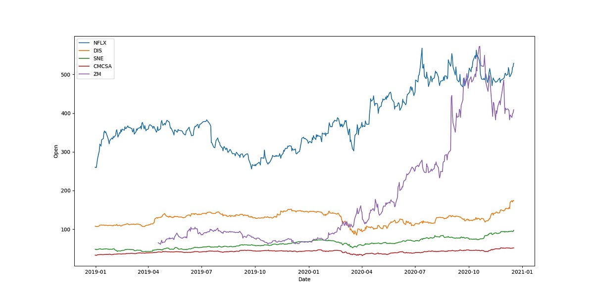
Lockdown means increased stay at home hours, which in turn means more screen time, or media consumption. The fastest growing stock was Zoom, growing from 80 in 2019 to 400 in 2020, going as high as 550 in between. Given a lot of schools and offices were employing zoom, it’s stock rose like no other. Netflix comes second with an increase of 200 points, from 300 to 500. Comcast, Disney and Sony were relatively stable, whereas i expected Sony to grow because of their PS5 launch, and increased game time during the pandemic.
Travel
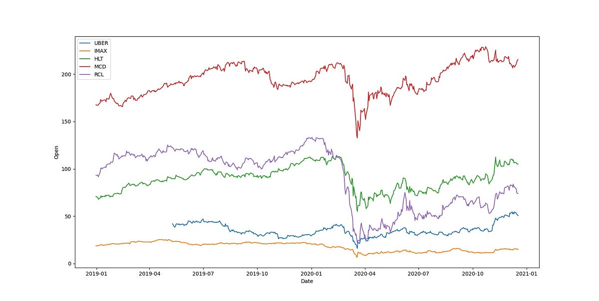
Travel industry took a massive blow. From hotels to theaters to restaurants, they were hit by an iron fist in a velvet glove. Uber (blue), and McDonalds (red) were relatively stable, maybe because of massive lay offs in Uber, but ship cruise company Royal Cruise (purple), and Hilton Hotels (green) dropped a lot just after the pandemic hit. Royal crusie shows no sign of recovering, whereas Hilton Hotel was pushed back 2 years, pulling itself up to where it was in 2019.
Aviation
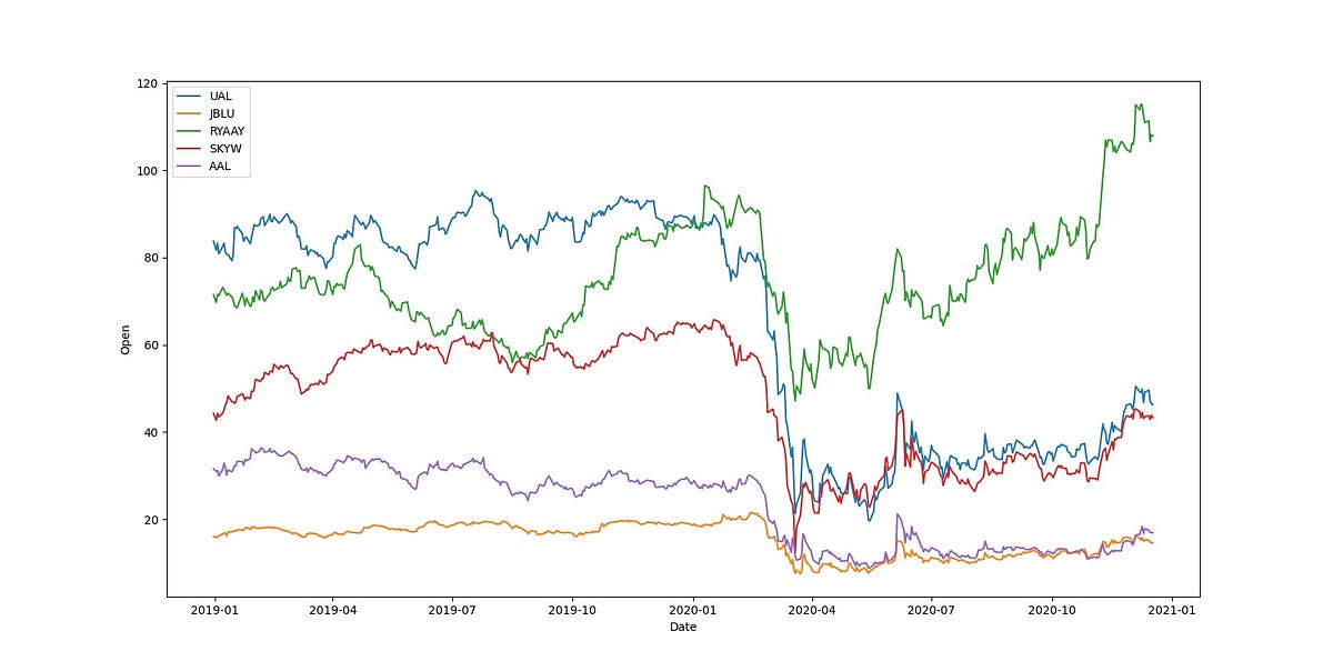
Airlines industry also took a massive hit. The airlines shown in the figure are United Airlines Holdings (blue), JetBlue Airways Corporation (yellow), RyanAir Holdings (green), SkyWest (red) and American Airlines Group (purple). UAL went from 80 in 2019 to 50 in 2020, AAl went from 30 to 20, which are not good figues, not to mention the layoffs in the Airline industry. The only company that has been profitable is RyanAir, going from 70 to 100.
Oil
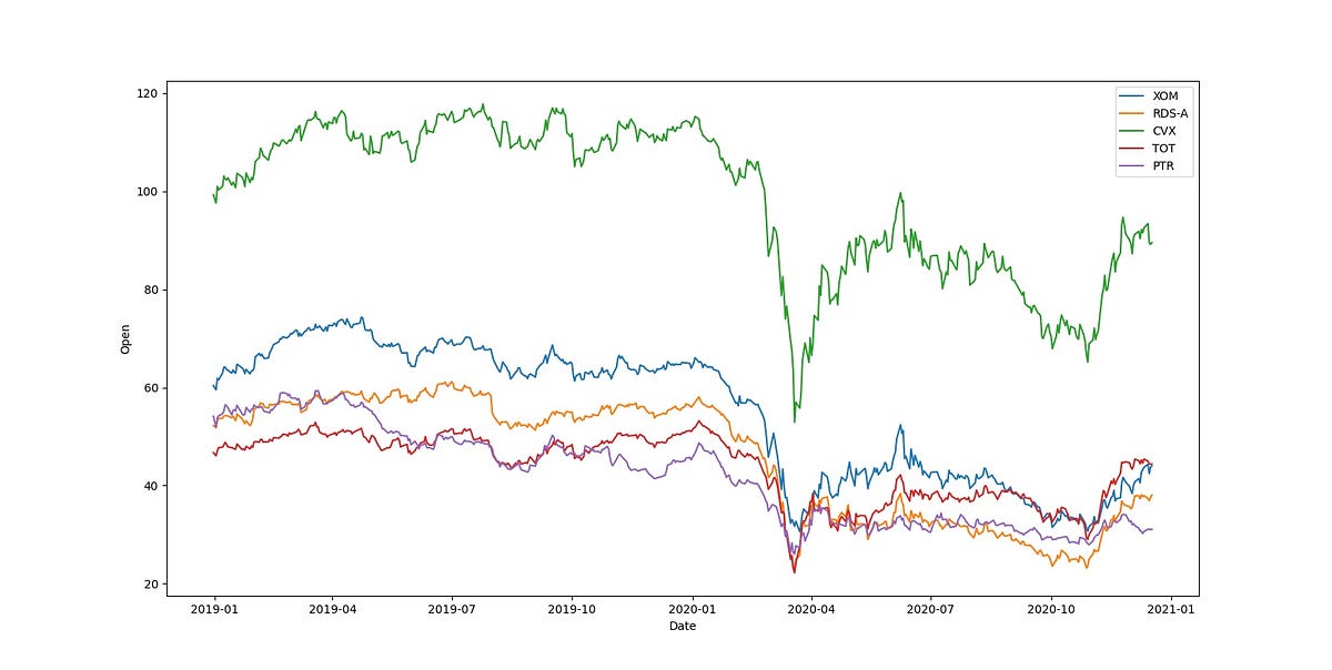
Oil industry was slowly going down. The companies in the plot are Exxon (blue), Shell (yellow), Chevron (green), Total S.A (red) and PetroChina (PTR). Recovering fairly quickly after the pandemic hit, they did lose share value for some time, but recently, during october, they all seem to be gaining value. Which means that road travel is going back to normal after the lockdown.
Conclusion
In this post we went through the current state of COVID cases, confirmed, deaths and recovered. We saw that India, Russia and Brazil had the most number of confirmed and recovered cases. Highest number of deaths were recorded in the US. Then we plot the pandemic in the last year, and saw that globally the count of confirmed cases and deaths was increasing. We then decomposed the graph and found that yearly pattern of coronavirus cases in the past year was similar to a sine wave from march to september, and i voiced my opinion to say that this might be the second wave. We then looked at how the second wave might turn out, and saw that 70 million people will be infected again, but within 2 months they will reduce to 10 million. Then we looked at markets and industries to find that media sector is booming, tech sector too, aviation and travel is down, and oil has started to recover, wheras pharma has not been affected too much by the pandemic.
I hope you enjoyed my post.
Comments
Post a Comment